Paint (or draw with color media) a bow (gift ribbon).
Medium:
Your choice of color medium: acrylic, watercolor, chalk pastel, oil pastel, color pencil, or a combination. Work from direct observation of an actual bow or ribbons.
Size: At least 6" x 6"
Objectives:
Medium:
Your choice of color medium: acrylic, watercolor, chalk pastel, oil pastel, color pencil, or a combination. Work from direct observation of an actual bow or ribbons.
Size: At least 6" x 6"
Objectives:
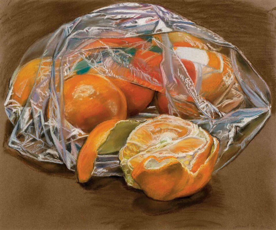
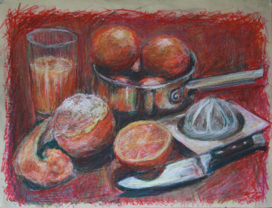
- Use chiaroscuro (light, middle, and dark tones) to make a rendering of ribbon or fabric look three-dimensional.
- Create a full range of value and good contrast, to make the drawing look real and "pop".
- Indicate color shifts (i.e. a red bow won't JUST use red; there will be warmer and cooler color shifts.)
- Use a refined technique with your color media (Whatever media you choose, it should look like a painting with rich, vibrant, smooth colors.).
 RSS Feed
