Studio Art Honors II & III
  • Current Assignments
  • Course Expectations
  • Galleries
  • Resources
  • Burlington High School Art & Design Program

Three Point Perspective Drawing

1/27/2022

0 Comments

 
Project Description:
After experimenting with one-, two-, and three-point perspective in your sketchbook, develop a large (18 x 24") three- or four-point perspective drawing in which:
  • forms are built upon forms
  • shapes are cut out of forms
  • it includes more than just box forms (Include pyramidal, conical, cylindrical, and semi-spherical forms as well.)

This can be representational or a three-dimensional "abstraction".

Bonus points for including life forms and a narrative or a fantasy element.

Possibilities include:
  • A detailed cityscape with a lot of character, unique architecture, and interesting, detailed facades.
  • A spaceship, fantasy automobile, or a complex real or imaginary machine.
  • An interior space with a lot of detail.

Remember to give this larger drawing a lot of character and detail, and use multi-point perspective to the best of your ability. Challenge yourself.

Size: 18 x 24"
Medium: Pencil and/or ink on drawing paper (Value and color is optional)

Resources:
Examples can be viewed in this Google Drive folder 
(Since these works were found online and are currently uncredited, the folder is only accessible by people in the Burlington Public Schools.).

There are a few books on linear perspective in the Portfolio classroom and plenty of resources online, including video tutorials.
0 Comments

Linear Perspective Analysis

1/24/2022

0 Comments

 
1. Find and print a photograph of a cityscape, or a painting by Canaletto, that illustrates 2-point or (better yet) 3-point perspective.

2. Tape the print to the center of an 18 x 24" piece of paper.

3. Lay an 18 x 24" piece of tracing paper over the photo/printout.

4. Using a ruler, trace ALL the straight lines of the buildings and streets, continuing them as they go back and converge at a vanishing point. Do this for all orthagonal lines.

5. Using this method, locate the horizon line and the vanishing points.

6. Your final drawing will be a series of many, many straight lines on an 18 x 24" paper. Be prepared to speak about the process, what you discovered, and anything that you found confusing.
0 Comments

Expressive Color Narrative

1/4/2022

0 Comments

 
Picture
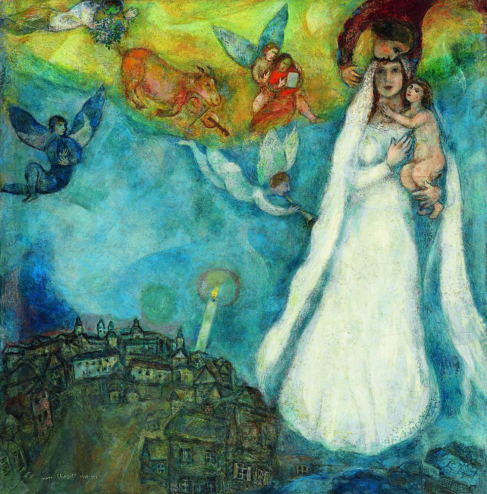
Marc Chagall, The Madonna of the Village, 1938-42

Due:
Part 1: One week (Steps 1 - 6 below)
Part 2: Second week

Project:
Create a narrative composition that uses subject and color to express a mood. You are telling part of a "story" of some kind. This is to be a completely original, well-designed and well-crafted portfolio piece, rich in color and refined in technique.

Medium:
  • Primarily oil pastels, but you may also include paint, color tissue paper, and/or other materials (may include "unusual" materials)
  • Work large, up to 18 x 24" - Paper could be white, toned, or color
  • First draft with pencil

Objectives:
  • Generate ideas/theme for personally expressive artwork.
  • Improve your skills with composition to grab and hold people's attention.
  • Use color expressively. Create a mood through color.
  • Experiment with design, with materials and technique, and with style. Try things out. Take risks.

To Start (Complete these 6 steps during the first week.):
  1. Think about subjects that might create strong feelings (You may refer to the "Psychology of Color in Film" Cheatsheet below for possible feelings/emotions to express, then come up with a subject that could illustrate that feeling in a powerful way.).
  2. Define your Subject and the Feeling/Emotion.
  3. Jot down visual ideas.
  4. Design your page by drawing at least 3 thumbnail sketches.
  5. Develop your best thumbnail sketch into a well-designed full-size rough draft.
  6. Make color studies using some type of color medium (watercolors, color pencils, oil pastels, etc.)

Tip:
Think about how SIZE and PLACEMENT can help to emphasize the most important things in your narrative.

Restrictions:
  • Do NOT write words to describe the feeling. 
  • Do NOT use hearts and other cliche symbols to symbolize feelings.
  • Think of your composition as the frame of a movie you have written and directed. What color scheme would the cinematographer use to denote the emotions you would like the audience to feel?

Time Commitment and Planning:
This should take a few hours to complete over the next week. Begin it today.

Learn from the Masters:

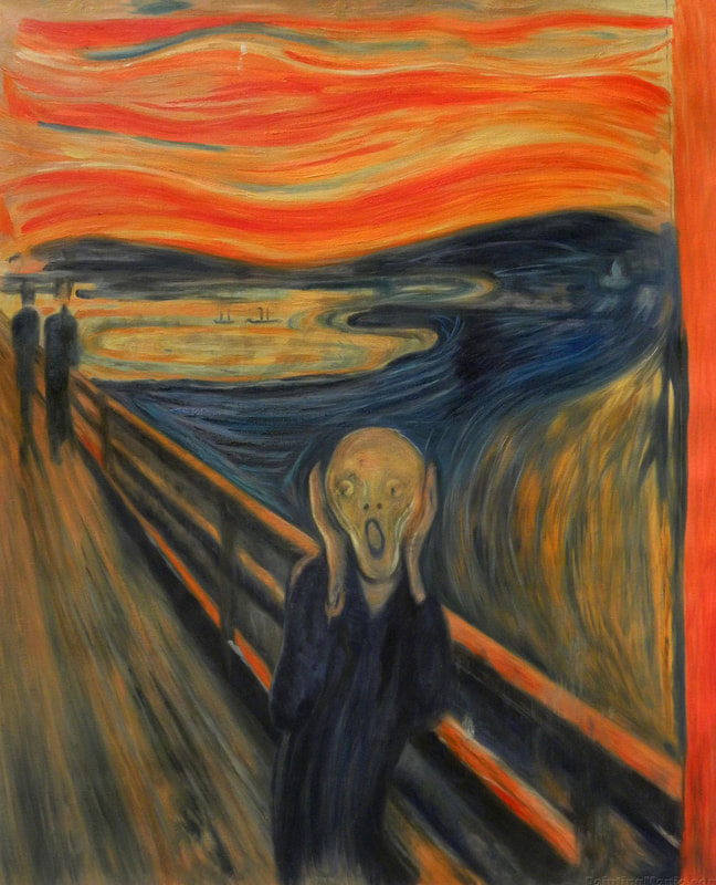
Notice how these artists use color expressively. Before beginning your own artwork, look up these artists and read about their work.
(Below) Vincent van Gogh was what we now call a Post-Impressionist painter:
Picture
Edvard Munch, The Scream, 1893

​(Below) These are all oil paintings from Pablo Picasso's Blue Period:

​(Below) These are from Picasso's Rose Period:

​(Below) Oil paintings by Henri Matisse:
Picture
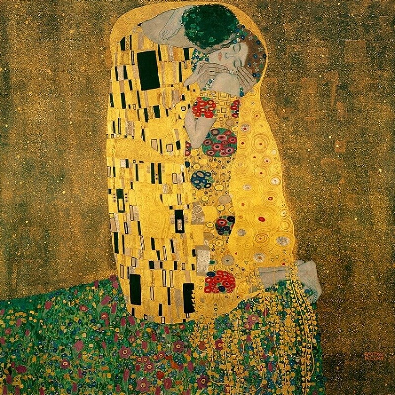
(Above) The Kiss, by Gustav Klimt.

​(Below) Oil paintings by Marc Chagall:
The image below is from studiobinder.com, which has informative articles and videos on the expressive powers of color in movies.
Picture

And click this link for Part 2 of The Psychology of Color: Movie Color Scheme Cheat Sheet.
​
And here's a quick guide from nofilmschool.com.:
Within each color are a multitude of hues you can break down to specifically hone in on the exact level of emotion you're seeking. 

  • RED – anger, passion, rage, desire, excitement, energy, speed, strength, power, heat, love, aggression, danger, fire, blood, war, violence
  • PINK – love, innocence, healthy, happy, content, romantic, charming, playfulness, soft, delicate, feminine
  • YELLOW – wisdom, knowledge, relaxation, joy, happiness, optimism, idealism, imagination, hope, sunshine, summer, dishonesty, cowardice, betrayal, jealousy, covetousness, deceit, illness, hazard
  • ORANGE – humor, energy, balance, warmth, enthusiasm, vibrant, expansive, flamboyant
  • GREEN – healing, soothing, perseverance, tenacity, self-awareness, proud, unchanging nature, environment, healthy, good luck, renewal, youth, vigor, spring, generosity, fertility, jealousy, inexperience, envy
  • BLUE – faith, spirituality, contentment, loyalty, fulfillment peace, tranquility, calm, stability, harmony, unity, trust, truth, confidence, conservatism, security, cleanliness, order, sky, water, cold, technology, depression
  • PURPLE/VIOLET – royalty, nobility, spirituality, ceremony, mysterious, transformation, wisdom, enlightenment, cruelty, arrogance, mourning, power, sensitive, intimacy
  • BROWN – materialistic, sensation, earth, home, outdoors, reliability, comfort, endurance, stability, simplicity
  • BLACK – No, power, sophistication, formality, elegance, wealth, mystery, fear, anonymity, unhappiness, depth, style, evil, sadness, remorse, anger
  • WHITE – Yes, protection, love, reverence, purity, simplicity, cleanliness, peace, humility, precision, innocence, youth, birth, winter, snow, good, sterility, marriage (Western cultures), death (Eastern cultures), cold, clinical, sterile
  • SILVER – riches, glamorous, distinguished, earthy, natural, sleek, elegant, high-tech
  • GOLD – precious, riches, extravagance. warm, wealth, prosperity, grandeur

0 Comments

Laying Out Your Palette

1/3/2022

0 Comments

 
There is a logic in setting out the paints on your palette. View this video about laying out some of the essential colors we use in Studio Art Honors II, III and AP.

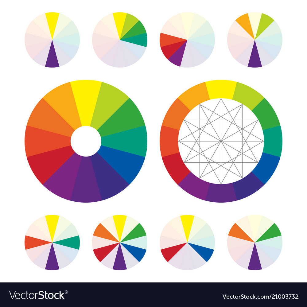
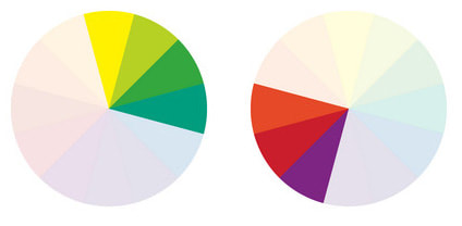
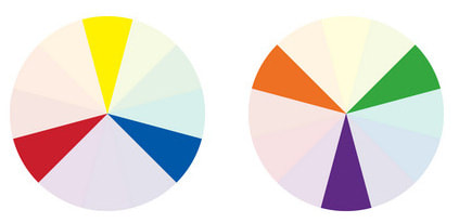
The images below show some options for laying out your palette. Notice that colors are grouped based on whether they are warm, cool, or neutral, with white and black in corners. Leave the large central area for mixing your colors.
0 Comments

Painting Exercises

1/3/2022

0 Comments

 
For Studio Art Honors II students with limited experience with color-mixing or painting, do these painting exercises.:
  1. Complementary Color Wheel​
  2. Combined Color Value Scale & Intensity Scale
  3. Five-Color-Scheme Painting​
  4. Animal Painting

Students in Studio Art Honors II with limited or no painting experience should do these exercises.

Students in SAH II WITH painting experience should work on the following: Make a grid of 1” squares on heavy drawing paper, and mix to match the colors of a master painting from the reproductions in the room or from the link in Google Classroom. Choose a painting that has at least 30 different colors to mix.
0 Comments

Color Glossary

1/3/2022

0 Comments

 
Picture
GLOSSARY OF COLOR
​
Color Slideshow Presentation

Hue
Classification of a color as red, blue, green, or yellow in reference to the spectrum.

Chroma
1. The purity of a color, or its freedom from white or gray.
2. Intensity of distinctive hue; saturation of a color.
Picture

Temperature
Higher color temperatures are cool (blueish white) colors; 
lower color temperatures are warm (yellowish white through red) colors.

Value
The darkness or lightness of a color. Tone. Tonal value
Picture
Primary Colors
The base colors from which other colors can be mixed: red, yellow, blue.

Secondary Colors
A color, as orange, green, or violet, produced by mixing two primary colors.

Intermediate Colors
Intermediate colors are the "third" category of color.  They are made by mixing a primary and a secondary color together.

Tertiary Color
A color, as brown, produced by mixing two secondary colors.

Complementary
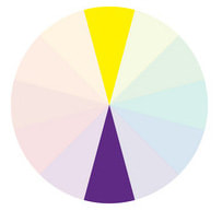
One of a pair of primary or secondary colors across from each other on the color wheel, as green opposed to red, orange opposed to blue, or violet opposed to yellow.
Picture
Neutral
Colors that are neither warm nor cool. Grays and browns are neutral colors.

Monochromatic
Having a variety of tones of only one color

​
Tint
A color diluted with white; a color of less than maximum purity, chromo, or saturation.
A delicate or pale color.

Shade
The degree of darkness of a color, determined by the quantity of black or by the lack of illumination.
Picture

Analogous
Colors that are adjacent to each other on the color wheel.
Picture

​Triadic
Colors in an equilateral triangle on the color wheel; such as red, yellow, and blue; or orange, green, and violet
Picture

Opacity

Opaque
not transparent or translucent; impenetrable to light; not allowing light to pass through.

Transparent
easily seen through

Some definitions are taken from dictionary.com and wikipedia.com.
0 Comments

    Mr. Ratkevich

    781.273.7024
    [email protected]

    Archives

    December 2022
    November 2022
    October 2022
    September 2022
    August 2022
    March 2022
    February 2022
    January 2022
    December 2021
    November 2021
    October 2021
    September 2021
    June 2021
    May 2021
    March 2021
    February 2021
    January 2021
    December 2020
    November 2020
    October 2020
    February 2020
    January 2020
    November 2019
    October 2019
    September 2019
    August 2019
    June 2019
    May 2019
    March 2019
    February 2019
    January 2019
    December 2018
    September 2018
    March 2018
    February 2018
    January 2018
    November 2017
    October 2017
    September 2017
    April 2017
    February 2017
    November 2016
    October 2016
    June 2016
    May 2016
    April 2016
    March 2016
    January 2016
    December 2015
    October 2015
    September 2015
    August 2015
    June 2015
    May 2015
    March 2015
    February 2015

    Categories

    All

    RSS Feed

Powered by Create your own unique website with customizable templates.